Sequis Life
Background
UI/UX Method & Technique:
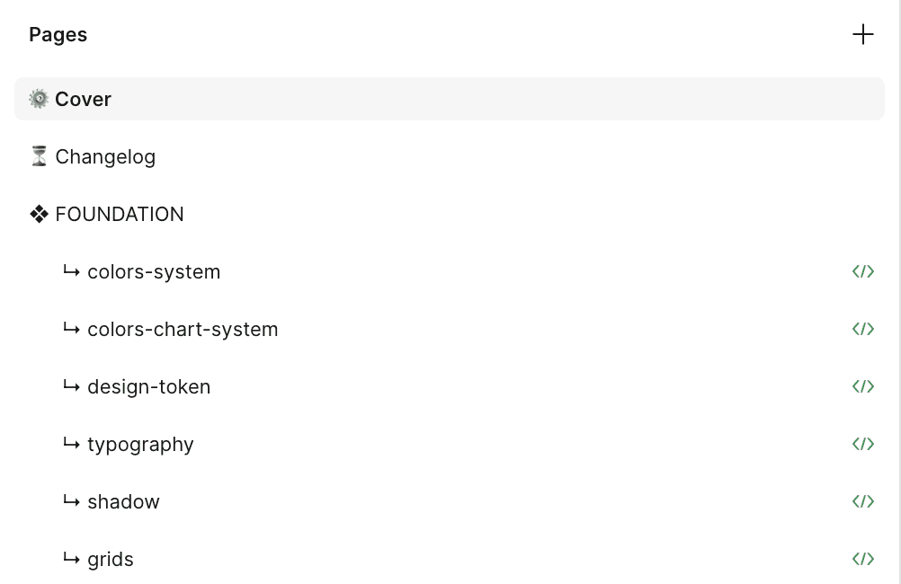
Styleguide
Library
Variables
Design Tokens
UX Audit
Approach
Once upon a time, Lead UI/UX Designer has a dream to have a design system that look like this https://namad.github.io/source-foundation-docs/ This is based on Source Foundation by Pavel Kiselev, and I had huge responsibilities placed on my shoulder. I'm a lone-wolf designops in product team, seeing the lack of parity between the design and the code, seeing old design system not too flexible for designers and not function enough for developers, it was a high time for a concrete design system.
How to start?
Observation
Observation of the product to identify what is needed—both what has been implemented and what is still missing.
Aligning Thoughts
Designers Mindset - Unpacking the ‘why’
Product Mindset - Generating the ‘what’
Engineer Mindset - Detailing the ‘how’
Look for the Pain Point
Designers: Not Flexible, too few color options, multiscreen size.
Engineers : Too many color options, multiscreen size, development time.
Collaboration
Stakeholder engagement
Proper Strategy
Execution
Research on Source Foundation Design System
When I started researching source foundation design system, I found out their key foundation design system are in colour system. Pavel build the perfect way to design colour system which developers can keep up and make a plugin in their library, and so does designers—my teams can choose a lot of colors based on its function and themes.
I continue to breakdown the system architecture, the colour system has three main components:
Global colors are a common library of colour swatches that sets the tone for your visual language
System colors bring a structure to enable light and dark mode transition
Component colors represent individual UI elements
After a while studying the way Pavel build the colour system, I also found the perfect way on my own to decide the colour system for my team.
Core problem
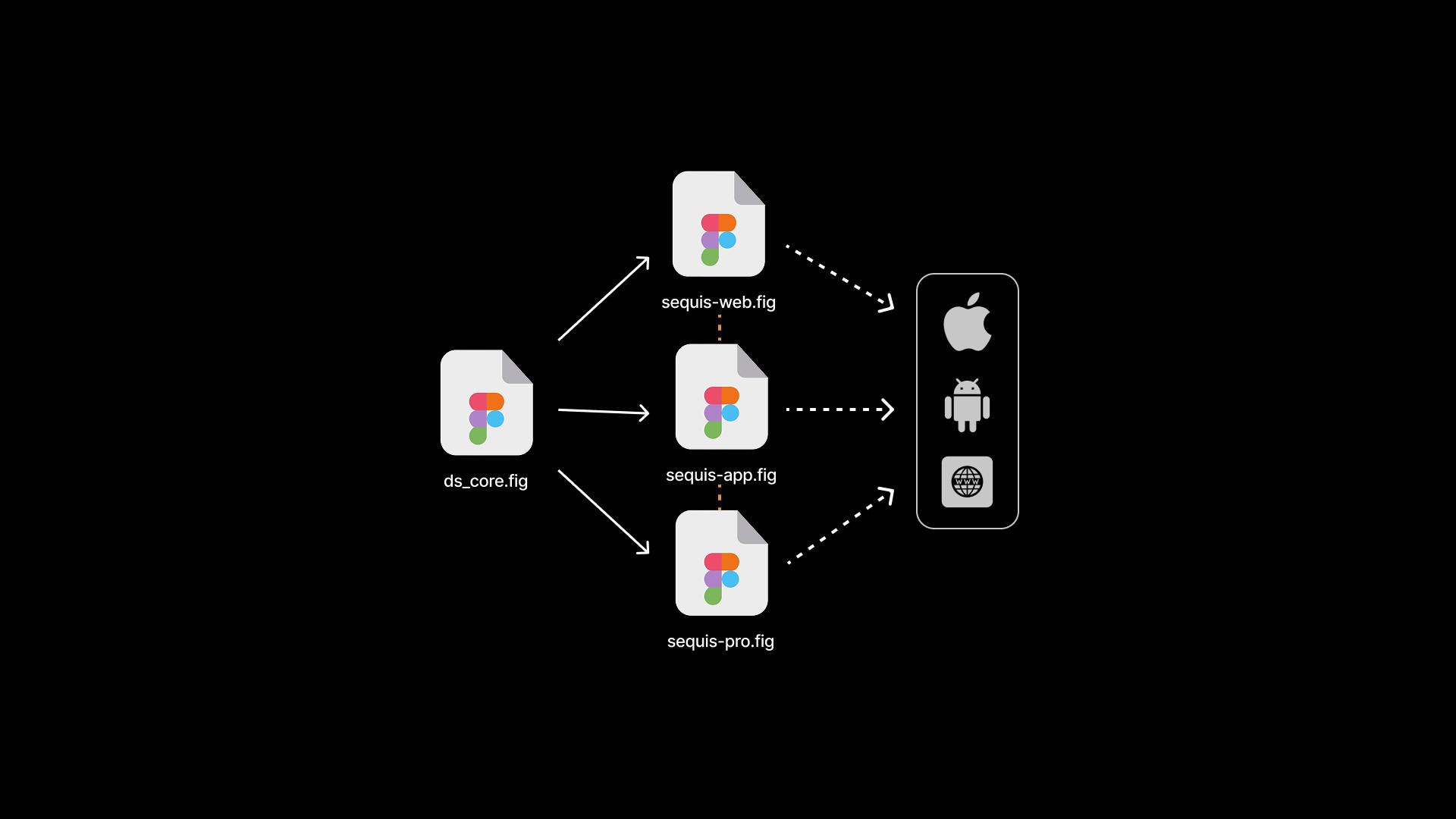
Maintained a single, centralized design system file to support multiple brands.
Utilized structured design tokens for consistency and efficient theming.
Ensured components were responsive and adaptive across breakpoints.
Designed components to remain intact (non-detached) for easy updates and scalability.
Enabled flexibility for designers to explore while staying aligned with the system.
Improved design efficiency and collaboration across multi-brand teams using Figma.
After I gathered all observation—research, aligning the mindset of designers—developers—product, and look for the pain points, I started to create my own version of design system for designer—dev teams.
Made with design tokens
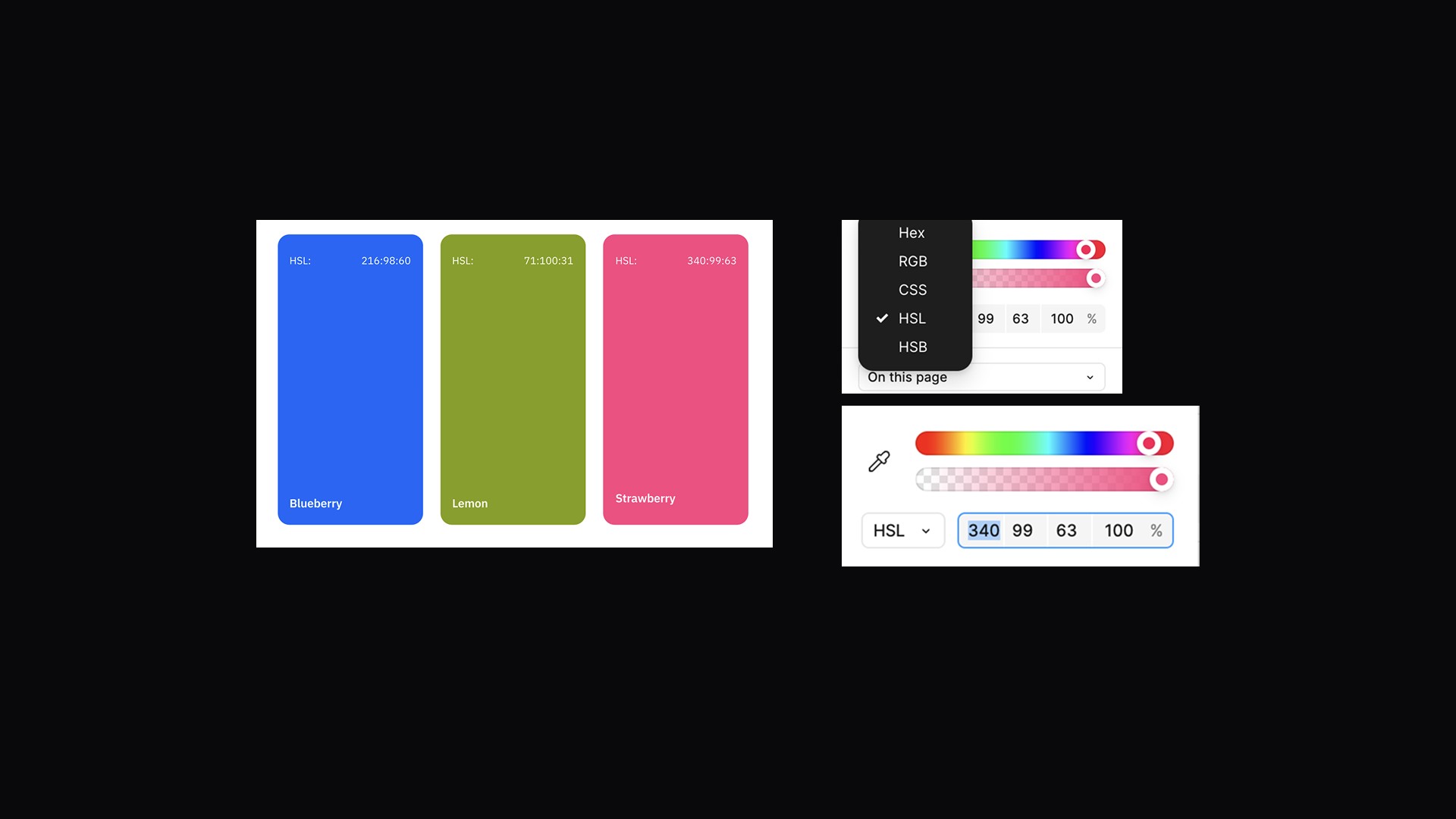
I started to learn about design tokens too—as well, since it's great and I can create each colour name in the system based on the token that I made, so it can be simple to communicate accross team—developers and also designers.
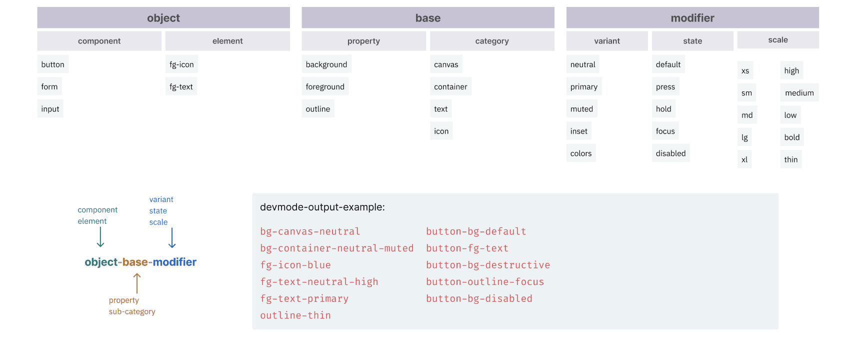
Each design token has a unique name and its corresponding value, there are lots of naming convention for design system, but for sequis design system, I use tokens based on semantic tokens or semantic aliases. Another common alias type is the component token. Rather than broader semantic names, they have names extremely specific to a component. To be sufficiently descriptive, a tokenized language that incorporates both taxonomy and typology needs many levels. Enough levels, as it turns out, to organize them into groups:
Base levels as a token’s backbone that combine property (background), and category (text).
Modifier levels to refer to one or more of variant (primary), state (hover), scale (xs, sm, etc), and mode (light or dark).
Object levels to refer to a component (button), element within a component (left-icon), or component group (forms).
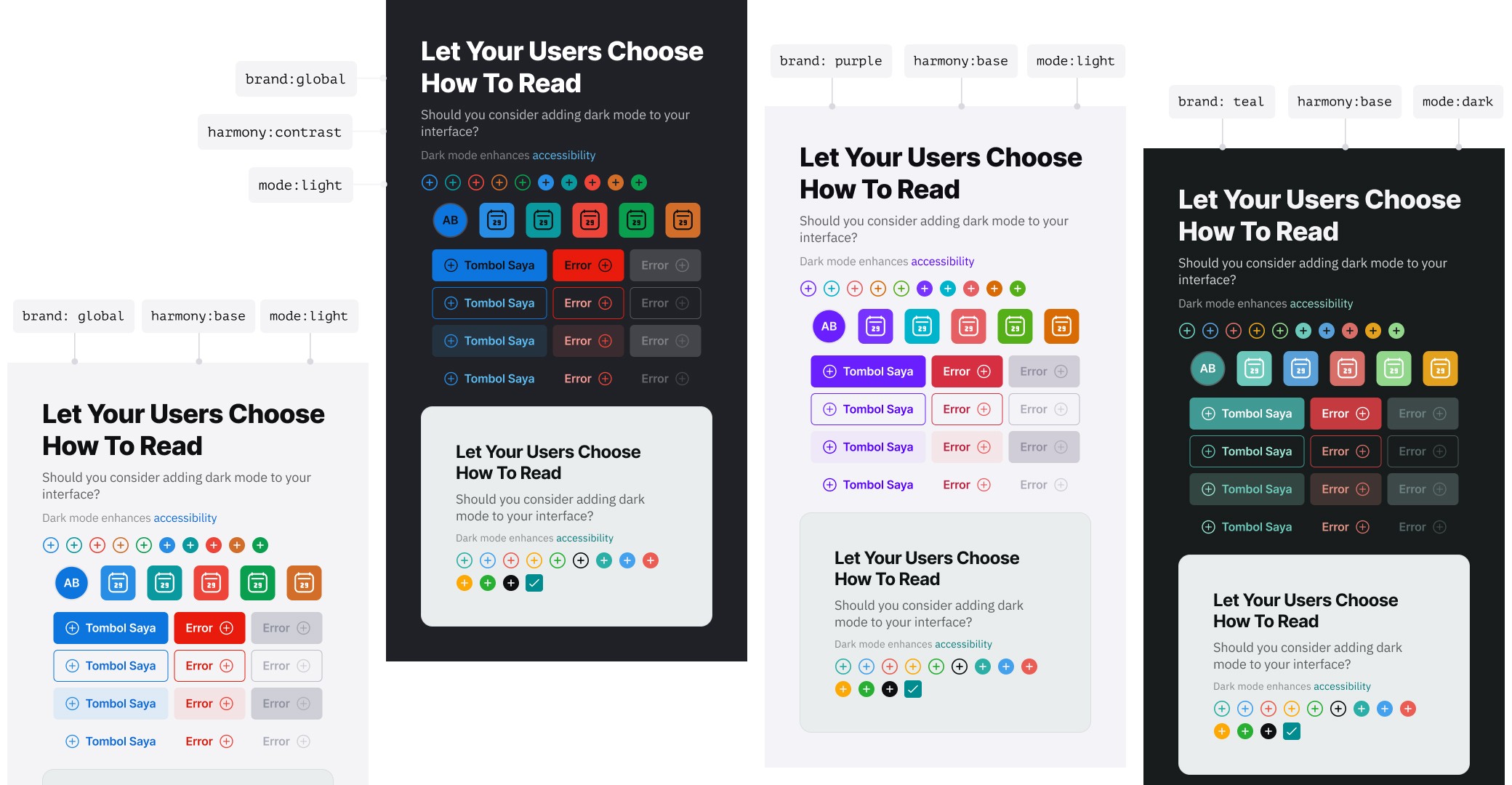
System Variables Architecture in Figma
If Pavel has three main component for his system architecture, on my design system—I created four main component architecture based on the needs for my team.
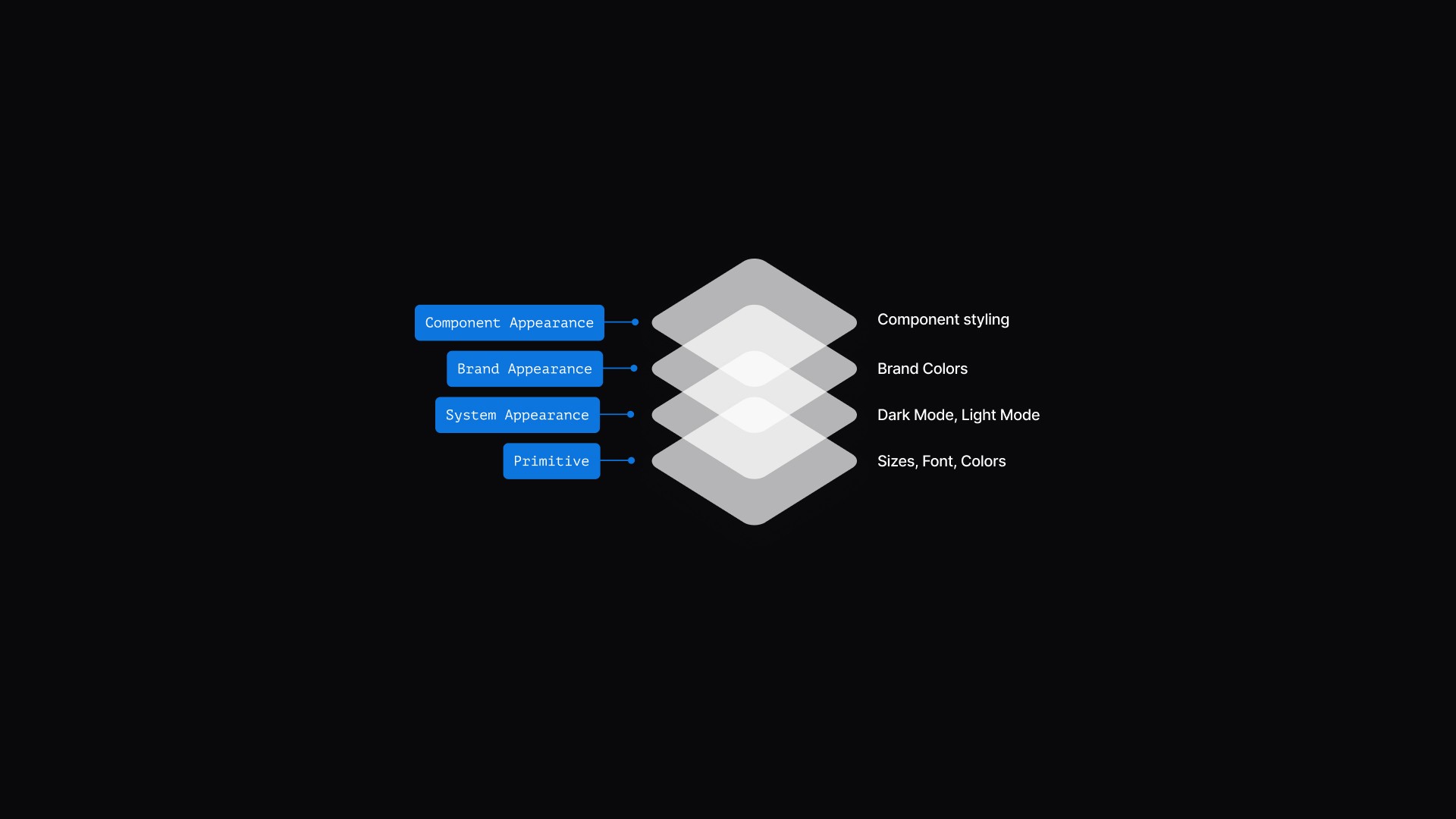
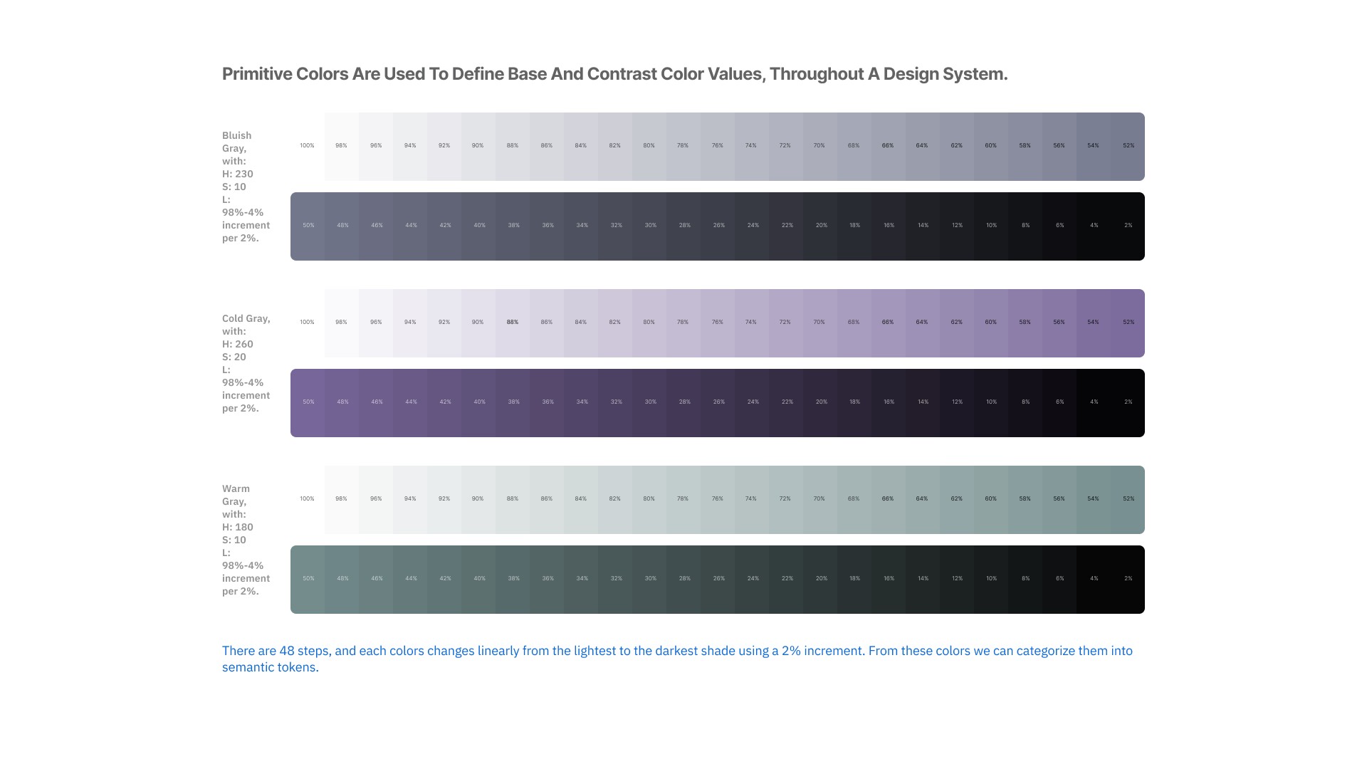
System Primitive: foundational tokens such as colors, sizing, and typography. Primitive colors are used to define base and contrast color values, throughout a design system.
System Appearance: modes like light-mode and dark-mode. Refers to design tokens (semantic tokens), that define the visual properties of a system depending on its mode or context, such as light mode and dark mode.
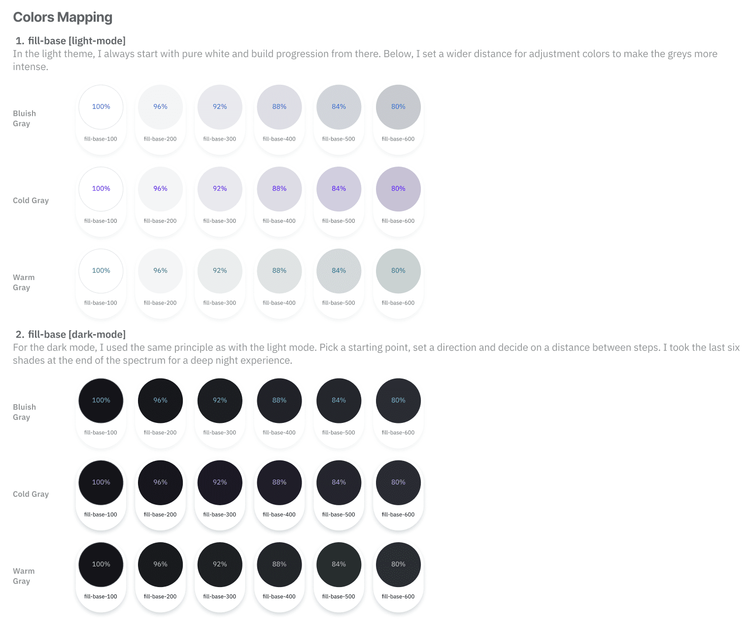
Harmony Appearance: theme levels, split into base and contrast. Refers to a set of colors that work well together for base, contrast and dark colors that support dark and light theme.
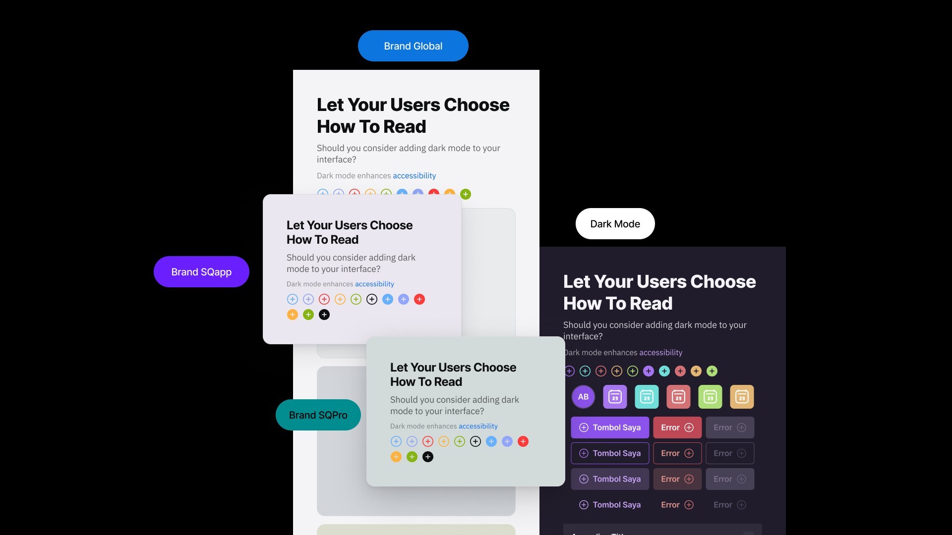
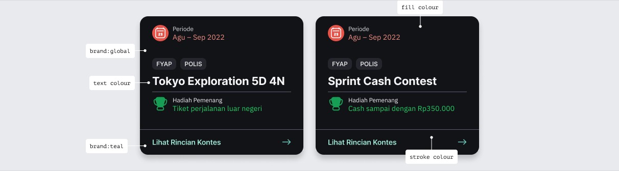
Component Appearance: brand-specific color tokens. Refers to naming token based on its functional, and each brands has different value. Sequis has more than one brand, and each brand has a different color theme. Let's refer to them as: Global Brand, Purple Brand, and Teal Brand.
Results and Impact
After I'm done with the colour system, I continue to create the styleguide for sequis design system. That consist of:
colour system
design token guidance
typography
shadow
layout grids
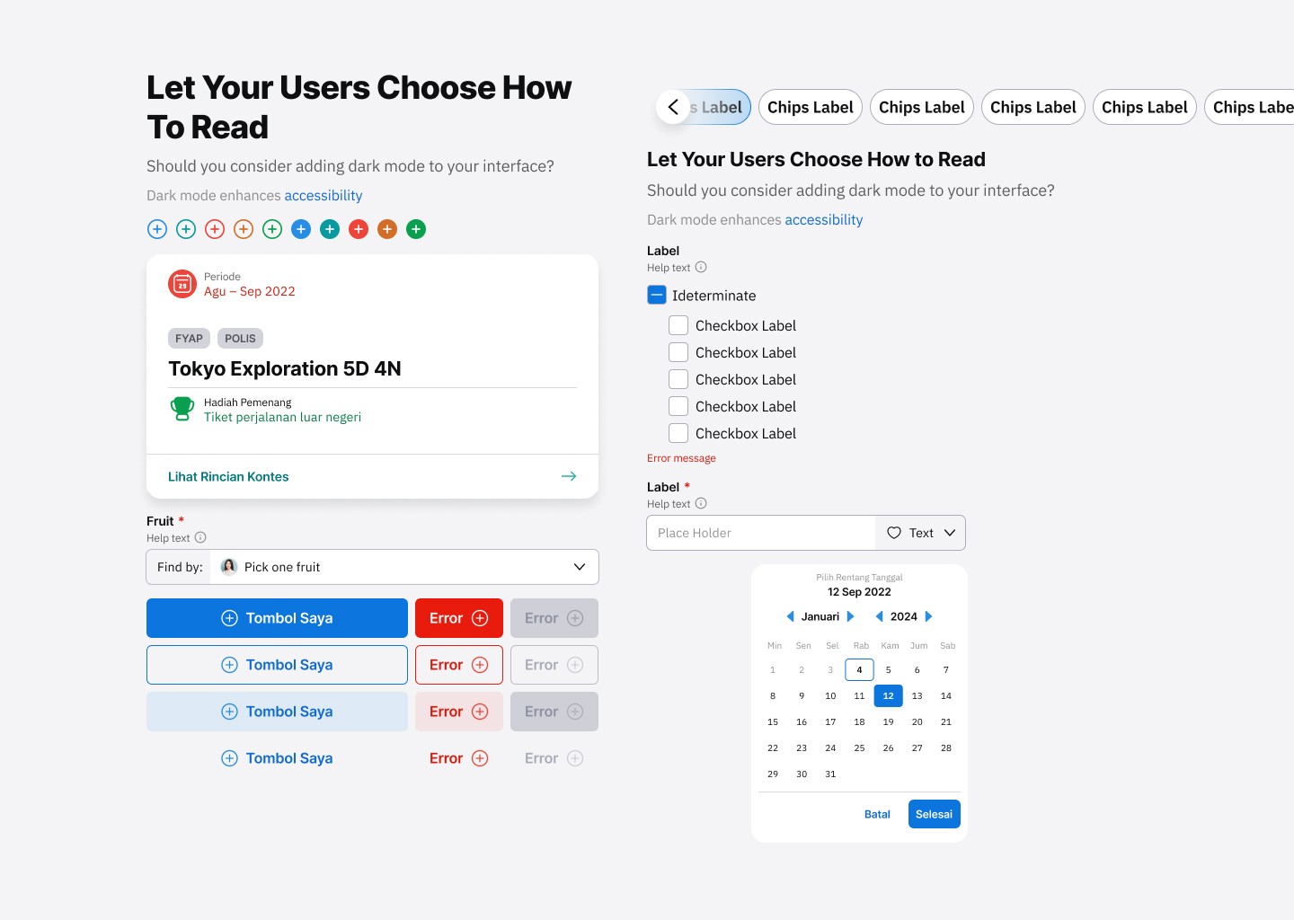
And also the component library that consist of:
component naming: a specific and unique UI component name, to avoid miscommunication between designers and developers. This needed to be clear so that the components would work as they were supposed to without error.
Documentation
Documentation is always included on the same page as the component this was to explain any use cases that were created. This consisted of:
A clear explanation for what this element is and how it is typically used, occasionally accompanied by dos and don’ts for context and clarification.
Picture examples so that it was clear what we were talking about
Rules of when to use the component and how to use the component
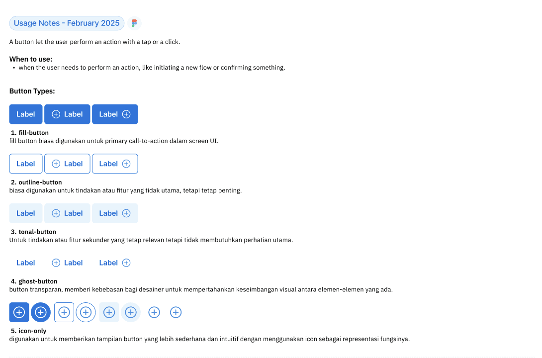
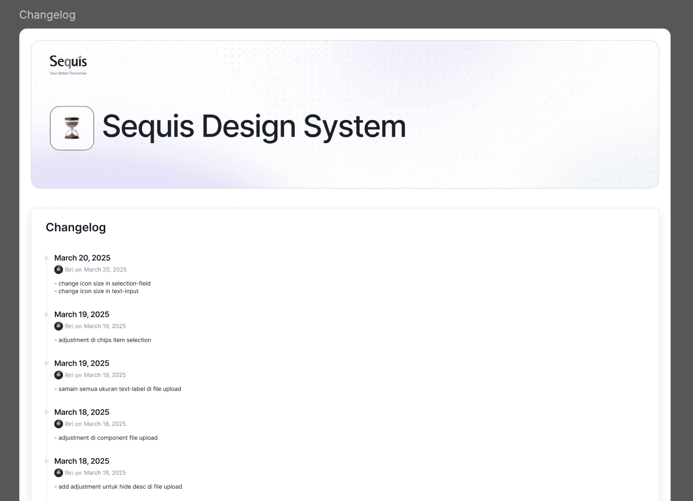
Changelog
Changelog notes are used to track and communicate changes made to the libraries over time.
Variables Result
My Role
As a designops, I hand-off this project to dev—team and then they make it into storybook library. My responsibilities, are from explaining the structure of the colour system—until documenting component usage and also versioning too. I created the ticket/task for each component library and explain the usage for dev—team, and track their work in Jira. If there any bugs, I will continue communicate with them and make another ticket-bug until it's as expected as based on the design component.
I also, delegate the system—on how to use—does and dont's to my team (UI/UX designers), so they can create a perfect UI into their screen and also a good UX based on the requirements from product managers.
The project continues to evolve, with ongoing feedback driving continuous improvements and the integration of each user journey into a unified experience.